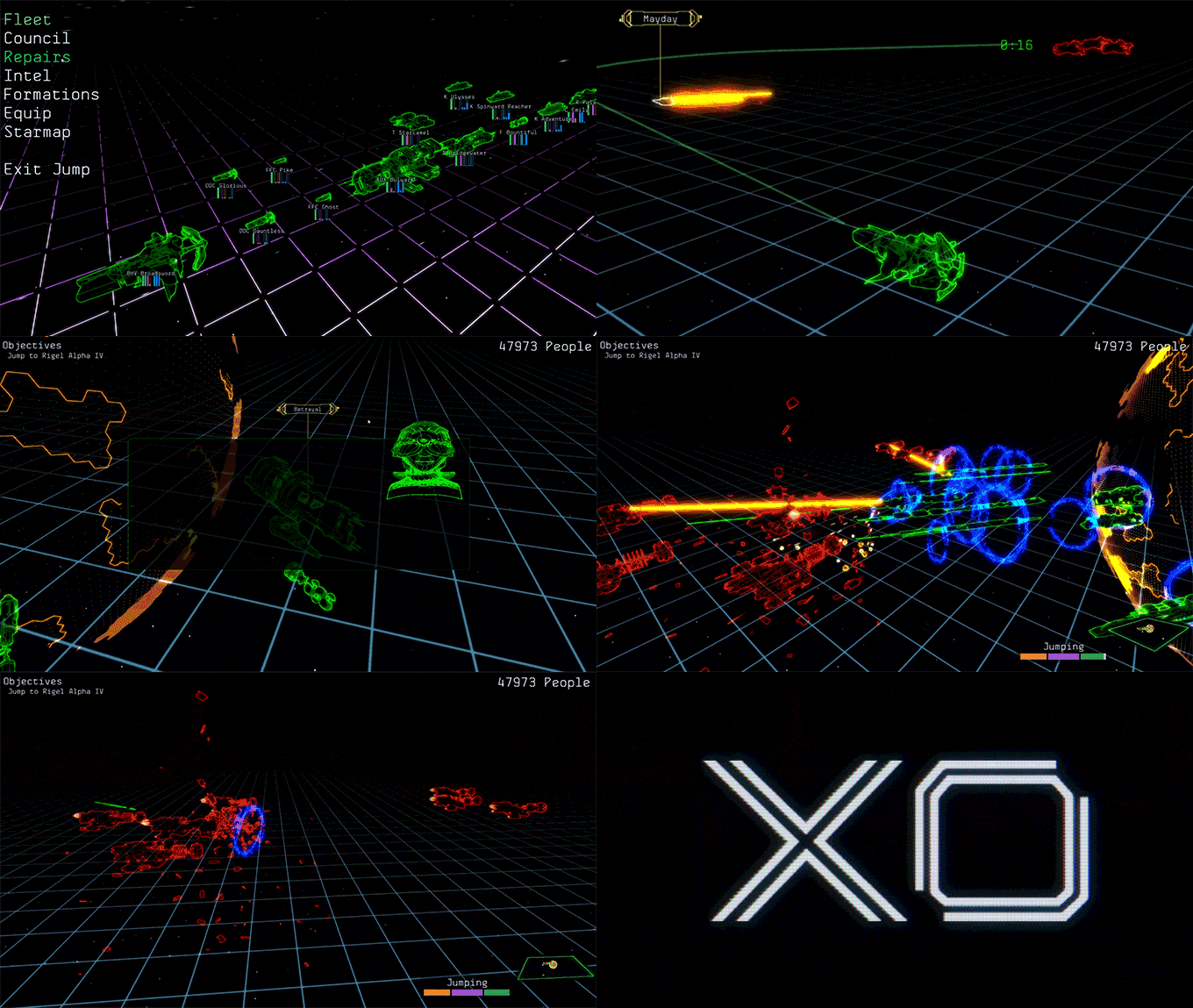
It’s only been a few weeks since XO was funded on Kickstarter, and I’m already getting quite a few e-mails asking for tips and advice. One of the coolest things about the indie dev community is how open most people are to share their stories of success?—?and sometimes failure. I read a lot of Kickstarter post-mortems this year (shout-out to my 3 favorites: Moon Hunters, Darkest Dungeon, and Aegis Defenders!) and researching other project owners’ experiences saved me from making a lot of mistakes that could have been easily avoided.
We still made mistakes, just different ones! And in the spirit of transparency and giving back to the community, I want to go over what worked and what didn’t work during our campaign.
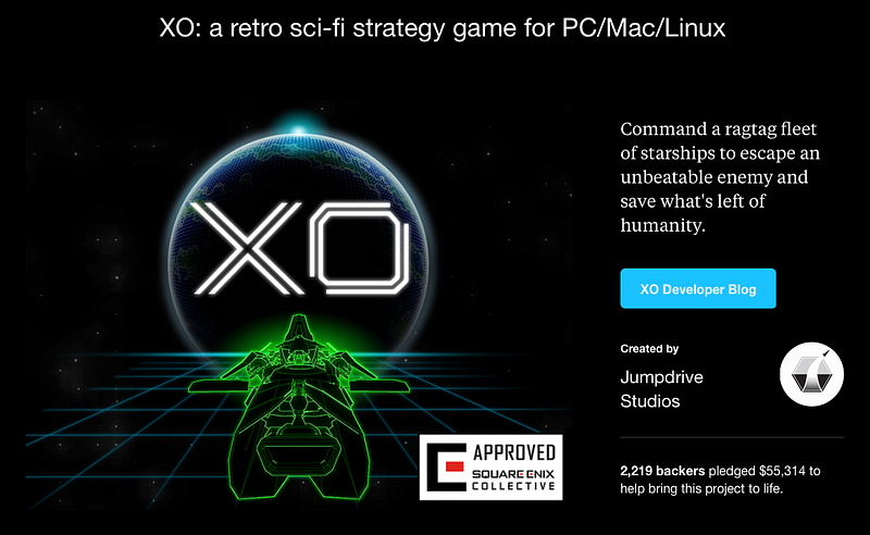
Disclaimer: Jumpdrive Studios is a team of 5 guys working full-time. XO was in development for 6 months before going to Kickstarter and almost all of my time went towards marketing. We also had the support of Square Enix Collective, which you can read more about here. We’re not the biggest studio to go to Kickstarter, but we’re certainly not the smallest?—?if you’re a lone developer, a smaller team, or working part-time you may not be able to take all of this on by yourself. Every project is unique, and my aim is to give you an idea of what worked for our game specifically?—?hopefully you can take away something useful for your own game!
Why Kickstarter?
Before you launch a Kickstarter campaign, you need to be able to answer this question. If you think that crowdfunding is an easy money grab, then I’ve got bad news for you. With countless stories of abandoned projects and empty promises, backers are more cautious than ever. To have a successful campaign today, you have to be ready to put in the work?—?not only to make your project stand out, but to assure everyone that you have the chops to follow through.
What’s awesome about Kickstarter is raising funds, interest and equity-free, while building a community of enthusiastic backers who truly believe in what you’re doing. We had people sending us XO fan art and fan fiction during our campaign; it’s super-empowering! There’s a reason so many indie studios choose to go this route, especially for their first game.
However, consider this: once you’re funded, you’re making a game with potentially thousands of people watching. Delays will get more criticism, changing features may piss people off, and Gods help you if you underestimated the amount of funding you needed to finish your game… We have a community to answer to now, and that means extra time and energy dedicated to keeping our backers updated. I’ve seen more than a few teams struggle with this recently; it’s not something you should take lightly.
Our 3 basic rules for crowdfunding: be transparent, don’t over-promise, and no knee-jerking.
Research and Planning
I ran a Kickstarter back in 2011, but a lot has changed since then. For the most part, I was learning to build a campaign all over again.
If this is your first rodeo, you’ve got a long road ahead of you. Although many of us have worked in the game industry for years, XO is our first project as Jumpdrive, so we’re relatively unknown and untested. Building an audience takes time, and it’s much more challenging without a prior release.
Here’s what it took to get things ready to launch:
- 6 months of preparation
- 22 dev blog posts
- 389 tweets
- 6 expos attended
- 3 pizza parties
- 4 weeks on Square Enix Collective
- 2 keynote talks
- 1 office break-in
- 4 Gamasutra articles
- 147 GIFs
- 156 bags of Naturebox snacks consumed
- 2 trailers
- 247 general contact forms filled out (twice each)
- 173 journalists e-mailed
During this time, the entire team was trying to find a balance between developing XO and marketing XO. While Brian (XO’s creative director and Jumpdrive founder) and I handled the heavy lifting, many times the development realm focused towards Kickstarter.
Analyzing Similar Projects
As I mentioned before, I read lots of post-mortems, I watched dozens of trailers, and spent weeks digging through every aspect of both successful and failed campaigns. I looked for red flags in dozens of Kickstarter projects?—?problems in pitch videos, expensive or uninteresting rewards, and unrealistic goals. It was often hard to judge what was actually working from one campaign to the next, but the data that I found was a great place to start figuring out what could work for XO.
Here are the places I kept coming back to for resources, feedback, and maybe a few fans:
This is just the tip of the iceberg, so be ready to do some serious homework and give yourself that extra time. I found myself in the Kickstarter research rabbit hole many times!
Picking A Launch Window
Since we were working with the Collective, we had to put together a schedule that worked for everyone. This turned out to be easy, and we launched when we wanted to, but I thought I should make a point of this since I’ve been asked about it before. We knew we had to be very careful selecting our start and end dates. Finding a 30 day window where there are no big gaming events and no major releases is hard. Now couple that with starting and ending in the middle or turn-of-the-month (to coincide with payroll checks and minimize dropped backers) and making sure your biggest days?—?the fabled first and last three?—?are on weekdays (thus avoiding weekends when Kickstarter is slow)… it begins to really narrow your choices down.
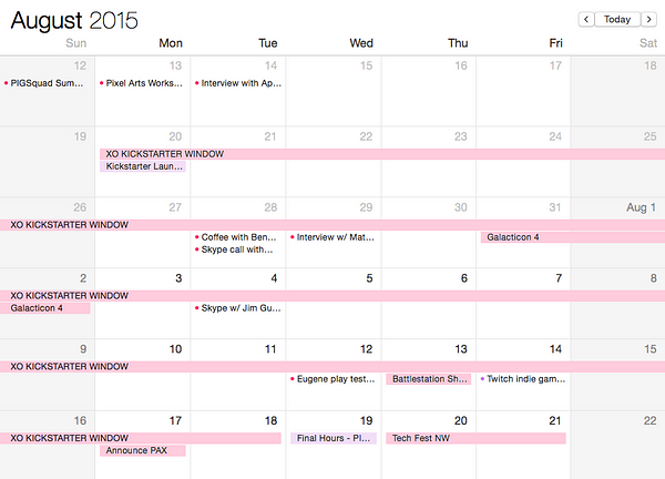
You’re probably well aware by now that the first 3 days are the most important in any Kickstarter campaign. This is when projects have the most visibility, and a campaign that gets funded quickly often surpasses their goal by leaps and bounds?—?after all, everyone wants to get on a bandwagon to support something successful. We managed to start on a Monday and end on a Wednesday, actually running for 31 days?—?which it turns out is better since Kickstarter subtracts 1 day when you kick it off (a 30 day campaign will read “29 days left” on the first day, for example.)
Originally, we were planning to start on June 16th… which just so happened to be the first day of a little event called E3. This would have been a disaster. I was so focused on smaller, indie events that E3 totally slipped my mind… luckily a fellow dev pal gave me a heads up. I remember my blood going cold for a minute when I realized what almost happened.
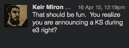
In any case… looking back, I believe that if we would have launched in June we would have failed. Around April/May we were submitting builds of XO to expos and gaming events, and we were generally rejected. Based on the feedback from Indiecade, SIX, and Indie Megabooth, we clearly needed to spend more time refining our presentation, and of course the development of the game itself.
Here’s a video that was sent along with a build of our game:
The progress we made on the game in the last month leading up to our July 20th Kickstarter launch was huge?—?not just in visual polish but in the way we were introducing the game to the player. The game didn’t change?—?but our ability to describe XO did, and that made all the difference. Pushing the Kickstarter back ended up being the best almost-flub that happened. I’m glad we had the luxury to be able to wait.
The Goal
Most people know that $40k isn’t enough to make a serious game?—?and that’s true for XO. We were upfront that we were self-funding first, and clearly laid out how the money raised on Kickstarter was going to be spent.
“We’ve all agreed to take meager salaries (or none at all) and forego other projects to bring this game to life… The extra funds raised by Kickstarter will go towards the features we don’t yet have in the game: additional sound design, a fully realized soundtrack, more events, more starships, more characters, more things to do.”

For us, going to Kickstarter was more than just raising money to expand the game. It’s our first project and we want to build a community. We looked at the Kickstarter as an effective way to prove our market and in a way have used it to find out just how long and hard we should to be working on the game.
There were a couple of uninformed comments about how we didn’t need to do a Kickstarter since we were working with the Collective. This was a common misconception; here’s a comment on Steam Greenlight about it:
“You have Square helping you with this, you don’t need our help. I’m saying no to this because it’s wrong. And also not what Kickstarter is for…”
I’m not sure what else we could have done aside from a big flashing GIF on the top of our page saying “Square’s not giving us money!” The truth is we’ll never know how much that perception hurt us?—?but personally I think having the Collective’s seal of approval on our campaign was more helpful than not. We had to go through a detailed assessment with them, which we could point to if anyone had doubts about whether or not we were up to the task of creating XO.
Kickstarter vs. Your Personal Life
I told myself I was going to put away my phone at dinner time, and not ignore my wife and son. I wasn’t going to be on my laptop making GIFs until midnight, or responding to emails at 3AM. I failed miserably. Everyone on the team has dedicated more than a normal amount of time and energy towards XO already, and I felt like there was a lot at stake. We really, really wanted a successful Kickstarter to help us finish this game!
Building and running a Kickstarter campaign can sort of take over your entire life. I was waking up at all hours of the night with new ideas for the project or some minor detail I was worried I’d forget before the sun came up. I tried my best not to let it affect my life at home, but it’s easy to let it become an obsession.
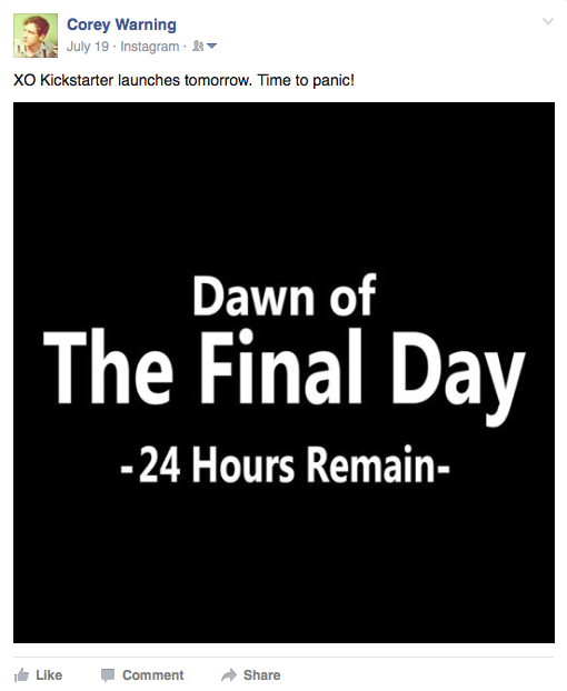
Then it’s time to start talking about going to Kickstarter. I didn’t have anyone tell me I was being annoying (to my face) but I’m sure most of my friends were sick of hearing me constantly talk about it for weeks and weeks. I started to feel like “that guy” for awhile trying to find the right balance… and I noticed that the number of likes/comments/shares steadily went down every time I posted a reminder or an update about our Kickstarter on my Facebook. I think that’s a pretty good indicator that I was burning people out.
Deciding how much I wanted to be shouting about Kickstarter on my personal channels was tricky. I decided not to be shy about it and shared several times on Facebook and Twitter, and in the end friends and family were some of our best supporters! They know better than anyone how hard we’ve been working on XO.
Our Project Page
By now there’s a certain recipe for a successful Kickstarter: lots of GIFs, some quotes from press and peers, concept art.. the usual stuff you see on every project page. Getting it all ready took months, but luckily Kickstarter lets you create a draft as early as you’d like, so we just kept updating it bit by bit.
Putting XO up on Square Enix Collective and Steam Greenlight Concepts was a really good exercise before finalizing our layout for Kickstarter. That also helped us with some early visibility!
There were about a dozen people we were regularly sending updated drafts of our Kickstarter page. Getting feedback from a variety of sources was priceless, and we were very lucky to have so many peers willing to pick about our page. I shared these drafts publicly on a few Facebook groups and reddit to ask for feedback. Ian (Lobster) Kragh, who I met on Twitter, provided us with some excellent insight and graphs while preparing our page and reward tiers. He’s backed quite a few projects, and if you get a chance to chat with him about your Kickstarter?—?heed his advice!
Layout
The best stuff goes up high! Here’s how we set it up from top to bottom:
- Gameplay trailer. There’s a reason Kickstarter locks it up there!
- A really compelling GIF for people who start scrolling without watching the video.
- A graphic showing that Jim Guthrie is composing our music (he’s pretty well known for working on some cool stuff.)
- Quotes from press and peers to give XO social proof.
- A concise overview of the narrative, gameplay, and scope.
We moved some things around (like our stretch goals after we were funded) but this felt like the best content to lead with. We talked about experimenting with the layout more, like moving the info about the Jumpdrive team higher, but for the most part we stuck to the order we launched with.
Below all of this was the deep dive into XO’s features, our team background, a breakdown of where we’re planning on spending the funds, and our risks and challenges. Wherever the reading felt too long, I tried to break it up with some images and GIFs?—?usually something to demonstrating the text above.

We totally obsessed over every line of text, but we knew that most people wouldn’t read the entire page. We were still careful to be as concise as possible and to avoid repeating ourselves. For the backers who cared enough to read about the finer details of XO, it was all there!
Main Image
For most backers, the main graphic image will be the first thing they see. This goes double for folks just browsing through Kickstarter… it’s a shame they won’t let you use a GIF for this. Our goal was to convey as much information about the game as possible in an image that would look good scaled down?—?I wanted one, single go-to graphic that would look good everywhere! If you’re around my age or older, you might remember going into a record store as a kid and picking up a CD simply because the album artwork looked interesting. We tried to think of our main image like this!
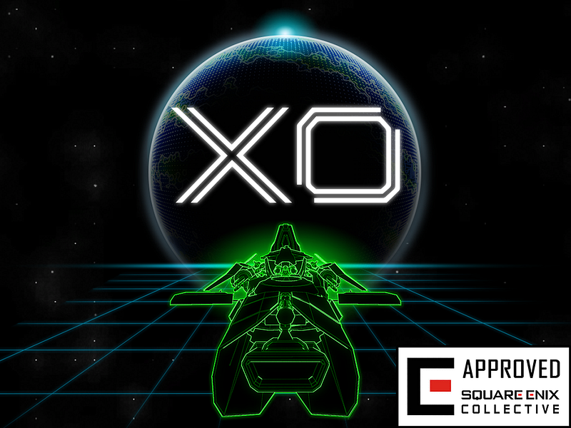
We also decided against using a ton of little tags, like Windows/Mac/Linux logos or the Steam icon. This clean approach is actually recommended in Kickstarter’s guidelines. The “Square Enix Collective Approved” stayed, and I think it helped initially draw people in?—?that’s not something you see on every project!
Title and Elevator Pitch
Early on, I got some good feedback from a non-gamer friend saying that our title “XO” didn’t tell you enough about the project. I never really thought about this before, but most projects don’t use this space to elaborate about their game. It’s basically free space to extend your elevator pitch, so this is where we put the info about the genre and platforms XO would be available on.
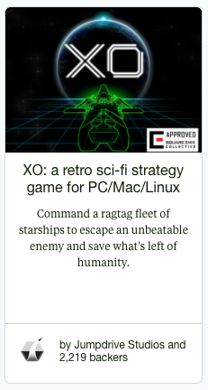
Pitches tend to go over better when they feel like a conversation rather than a speech, but that can be hard to capture in less characters than a tweet. XO’s elevator pitch was a work in progress since the very first press release I sent out. I wrote about crafting your pitch in another article?—?and the line has even changed since then! Our goal was to make potential backers’ ears perk up and click through to learn more.
One thing that threw some people off was the use of the word “unbeatable” describing the enemy. This led some to question whether or not XO was winnable, and I had several suggestions to change it to “unknowable,” “overwhelming” or another synonym. The message we were trying to get across here was that you’re outnumbered, outgunned, and on the run. In the end I decided to leave it because, honestly, I think it has a better ring to it. Also, it usually led to a larger conversation about the entire game, which I took as a good sign.
Social Proof
Many projects spread quotes from press and peers throughout their page. This is a great idea, because it lets others know that there’s already excitement about the project from influencers.
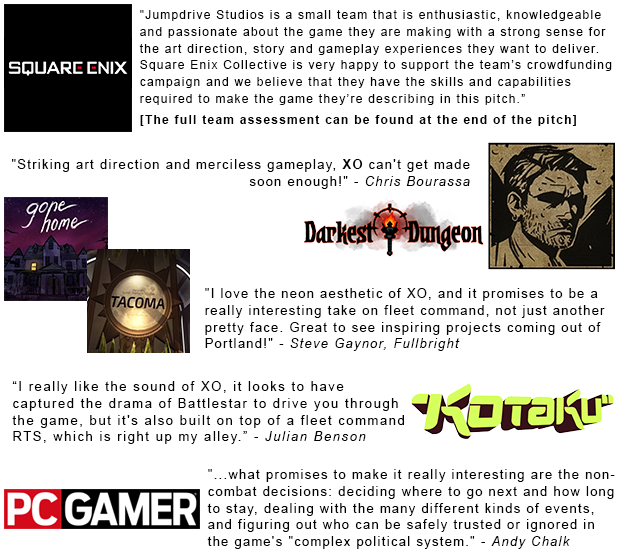
The bit from Square Enix is part of the whole package when working with the Collective, and the blurbs from PC Gamer and Kotaku came shortly after we launched?—?which brings up another great point! We made changes to our page during the campaign to keep up with new press. We were still careful to be as concise as possible and to avoid repeating ourselves.
Rewards
This is your bread n’ butter. Deciding what goodies we wanted to include and sorting out pricing and production costs took up more time than almost every other aspect of our Kickstarter. We ended up putting together a really detailed spreadsheet, which we’ll share in a future post?—?So keep an eye out for that soon!
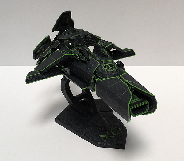
Right away, we decided we didn’t want to do many physical rewards, and the ones we did needed to gel with our audience. I have plenty of experience with merchandise from my days in a band, and I’ve kept good relationships with a few awesome production teams. This was a huge benefit because I already knew where to go for top quality goods at the best price, and in some cases was able to call in favors to keep our costs down. 3D printing was new territory however, so we sorted that out well before Kickstarter. It was the hardest reward to work on, but the folks at EUCL3D are total pros?—?I still can’t believe how awesome these turned out…
We’re working on another blog post where we’ll get into the nitty gritty of planning our reward tiers. For now here’s an overview:
- We skipped the $1 tier: we felt like $10 was a low enough ask for the first option, and I’m just not a fan of ‘em. We still had people pledging $1 for no reward, as if to spite me.
- We tried to keep the gaps between reward tiers as small as possible to encourage backers to increase their pledges.
- We only did a few Early Bird tiers and put a one week deadline on what we thought our most popular option would be. The hope was that backers would get on board early.
- We were very careful to calculate our costs for international shipping, development and admin time, and creating artwork.
- We didn’t include an option for add-ons, after hearing about how much extra work that can be on project creators for fulfillment. After all, we started Jumpdrive to make games, not merchandise.
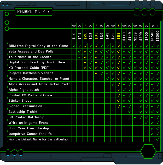
Important: We knew that once we launched our project, we couldn’t edit our reward tiers. Kickstarter won’t allow it! So we read over everything 10–20 times and made sure we didn’t forget to add international shipping, or accidentally copy/paste a reward that shouldn’t be in a tier.
The Trailer
Without a doubt, your trailer is your best asset on Kickstarter?—?and for marketing in general. We put more work into our video than any other aspect of our campaign.
Some teams use their art assets to create a video that showcases their concept. There are pros and cons to this approach, as some backers may feel uncertain if the creators can deliver what they’re promising to build in the trailer. We decided early on that we wanted to use in-game footage for our video, and while we liked the results, there’s a downside to this approach; it took a lot more time. If you’re developing your game while putting together a Kickstarter, as we were, pulling the whole team off of system-building to polish up movement and visual effects can feel a bit like working backwards.
Originally I wanted to have two separate trailers?—?one to release to press four weeks before our Kickstarter and another to launch along with the campaign. I read about a similar approach from Darkest Dungeon’s post-mortem, and I thought it sounded pretty perfect. This way we’d have one to promote the game before Kickstarter, and help build an audience beforehand. The second would give fans something new to be excited about, and press something new to write about.
However, as time went by it became clear that we wouldn’t be able to pull this off. It was taking much longer than we anticipated to finish one trailer, so we decided to just focus all our energy on making a single, solid Kickstarter video. We figured that plenty of people would be seeing XO there for the first time anyway. So we set a deadline for the end of June, which would give me 4 weeks to work with.
After a long talk with the Starr Mazer team, we were convinced that our trailer needed to be around 45 seconds long (If you haven’t seen their Kickstarter video, go check it out?—?it’s a great benchmark to aim for!) The reason behind this is that most people will only watch about 40 seconds before their mind goes elsewhere… and when that happens you want them to look a little to the right and click that “Back This Project” button. Turns out they were right on the money, check out the data from our final trailer with over 10,000 views on Youtube:
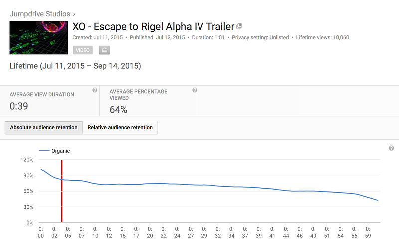
Try as we might, we just couldn’t get the trailer down to 40 seconds without feeling like we were leaving something important out. Still, 60 seconds is pretty close!
A few other things we knew we wanted to avoid: no company logo ken-burnsing at the beginning, (no one knows who we are yet) we wanted the text beats to stay on top of footage so we didn’t lose gameplay to a black screen, and we decided to skip all of the talking heads stuff. I think it works for a super charismatic team, but it’s not really our style so we skipped it.
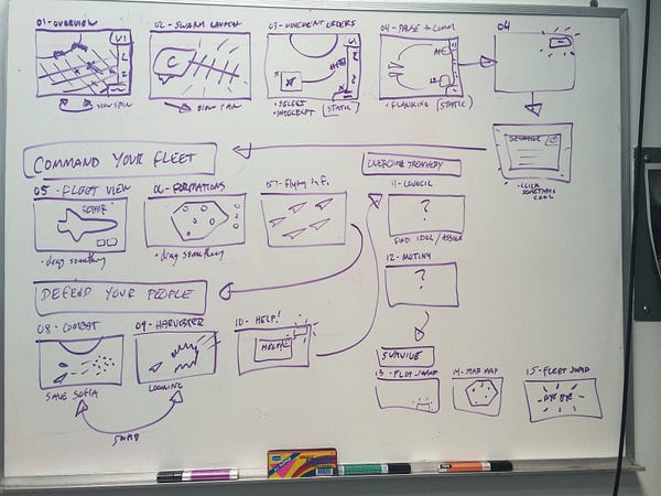
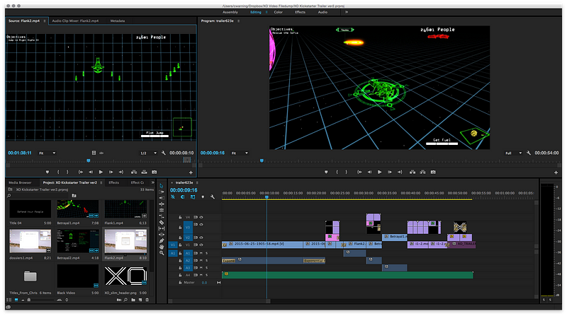
I knew enough about video editing in iMovie, and had a few friends help me along the way to pick up on working in Adobe Premiere Pro. The really hard part was making the trailer feel like it was telling you a story. We watched several videos from failed strategy game Kickstarters, and the biggest thing we wanted to avoid was the action-game, quick cut trailer. Our goal was to give the viewer a good sense of how the game would be played, the vibe of the world, and to nod at the inspirations for the project.
This took dozens of iterations, and we scrapped a lot of ideas along the way. Here’s the very first storyboard cut I put together in May, little over 2 months before our Kickstarter launch:
I used a lot of old movies we’d recorded with OBS to create GIFs and other promo videos. From this point on, I updated the trailer almost daily. It was really helpful to have a super rough cut and improve each scene as the development continued, dropping in better shots in-between working on other areas of the Kickstarter.
After showing the video to a handful of people, it became pretty clear that our vision wasn’t resonating with anyone else. We had fallen into the classic trap of being too close to our own project. So we went back to the drawing board, and put together a second rough cut around mid June (1 month to go):
Now that we had a better draft to improve on, we worked really hard to get the camera movement and timing of each scene as perfect as possible. This was a ton of work for the entire team, and while it would have been faster to hire out for this trailer, there’s something to be said for how much we gained in experience.
We continued to share revisions with friends and peers, and used that feedback to help shape the final trailer… which we wrapped up with just one week to spare:
We ended up releasing the trailer 3 weeks behind schedule, which didn’t give me nearly as much time to get it out to press as I would have liked. We made it work though, and I’m glad we didn’t rush because the final result was much better than where it was earlier that month.
Important Note: Right now, Kickstarter will compress your videos to 4:3 ratio, and they will not be HD. This confused me until I reached out to KS support, because after your campaign ends, your video gets pushed down into your campaign page and fits to 16:9. I kept looking at finished project pages and couldn’t figure out what I was doing wrong… I’d still recommend exporting them at 1920×1080 for everywhere else on the internet, but if those black bars are going to keep you awake at night you may want to consider making a different version of your trailer just for Kickstarter.
Our trailer also ended being my main source for GIFs to spread throughout our Kickstarter project. On that note…
The Perfect GIF
A few weeks before our Kickstarter launched, I saw this GIF that Firewatch made and a little light went off in my head.
I’d been making GIFs for a while at this point, and I was getting pretty good at it thanks to some advice from the GIF Grandmasters at Powerhoof. I had a collection of animated images for just about every aspect of the gameplay, but this one overview GIF was my pride and joy. I would send this out in emails, in mentions on Twitter… just about everywhere. Everybody loves GIFs!
Much like the Firewatch GIF, I took four great shots from the Kickstarter video and ended with our animated logo.. Next to your trailer, I think the overview GIF is one of your most important marketing assets, and something that every team should create. It’s the perfect way to catch someone’s eye while they’re scrolling through pages of posts.
Getting Out There
We didn’t want to rely solely on the Kickstarter community to get funded, so we shouted from the rooftops well before launching. And I’m sure we would have failed if we went into Kickstarter cold.
Press
Getting press is hard.
Getting press early in development is hard.
Getting press for your upcoming Kickstarter is hard.
Expect to feel invisible for awhile. Many of the big guys don’t want to write about something they can’t get their hands on?—?which, to be fair makes total sense. But it still sucks, because Kickstarters need coverage!
My plan of attack was to only contact press when I felt like we had something meaningful and new that was worth covering. Most of the time I was wrong. For example, the first PR I attempted was a recap of showing XO at the Oregon Science and Industry Museum. I put it out after the event (first mistake) and couldn’t even get the local media to talk about it. But I learned from each failed press release and eventually we had something worth writing about.
I’ve heard that many people try to avoid mentioning Kickstarter at all when they contact press. For what it’s worth, I was up front that we were crowdfunding and that I was looking for Kickstarter exposure specifically, and we still were able to get a good amount of press. I attribute a good amount of that to the efforts of Square Enix Collective, as well as the months I spent finding the right journalists who would actually be interested in XO.
The key for us was working out what the story was ahead of time, and then pitching it to journalists knowing that they would have to pitch it to their editors as well. We had a few angles here:
- Square Enix Collective approved project
- Everyone loves Battlestar Galactica
- Space games are hot right now
- The Portland indie scene is blowing up
- Jim Guthrie is doing the soundtrack
- Our game is very, very pretty
I tried to highlight as many of these points when I could, without being a total goon about it. Eventually I started getting responses back, and was able to keep a small group of interested writers in the loop for our Kickstarter launch.
Events, Expos and Cons
Before Kickstarter I attended GDC, iFest, Power of Play and a few other events around the Pacific NW. I realize not everyone has the means to make it out to events like this, but if you can go, GO. I wrote a bit about my guerrilla style marketing at my first GDC here.
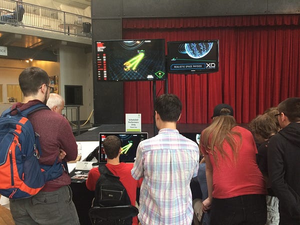
As I mentioned before, this is where I met a lot of other indie game folk. Sharing ideas and supporting each-other is a big part of the gaming culture right now, and definitely refreshing to me, coming from 10 years in the music industry. I met Steve Gaynor (Fullbright) on the flight home from GDC, and since we’re both in Portland we kept in touch. He’s seen XO at a couple events since then, and was kind enough to provide a nice quote and even a few tweets about the game when we launched. Chris Bourassa (Red Hook) gave a talk at Power of Play in Seattle, where we were demoing XO, and we hit it off on art direction and Batman. This was yet another reason to get out there and show our game off!
Local meetups were almost always worthwhile?—?some of us at Jumpdrive actually met at them! We went to Unity gatherings and most events our Portland Indie Game Squad (aka PIGSquad) put on. I shared a lot of content with other PIGSquad members before our campaign?—?it was definitely one of our best sources of feedback and our community also gave us a huge boost during the Kickstarter.
Steam Greenlight
I recently wrote about our experience on Greenlight, which we ran at the same time as Kickstarter. Here’s an excerpt:
“I pushed Kickstarter and Greenlight live within seconds of each-other. When I was planning our campaigns, there was never a doubt in my mind that this was the right move. I felt confident that I could manage both at the same time. However, if you don’t have someone on your team dedicated to running the show, this can be extremely difficult.”

In that blog I also talked about which outlets I focused on when sharing XO online. I’d recommend checking that out if you’re new to Twitter, Facebook, or reddit?—?which were our outlets of choice.
So… Ready To Launch?
The truth is there is no magic strategy to succeed on Kickstarter. I tried to cover everything I can remember about preparing for XO’s campaign, and if I missed anything I’ll update this post-mortem with some more information. If there’s anything else you’d like to know about our preparation before launch, feel free to leave a comment here.
In the second part of my Kickstarter (which I’ve already started to write!) I’ll break down how our 30 day campaign went; stretch goals, backer missions, and what happened after we were funded in 12 days.
– Corey

