In August we continued putting in the user interface (UI) for the game — and working on all of the systems behind them.
Marquee selection for multiple ships was perfected, contextual actions were refined, some adjustments to colorblind mode were made, and we finally have lasers back in HDR now! Resource collection and use were also completed.
The entire soundtrack is now in the game, and almost all of the sound effects as well. It sounds fantastic!
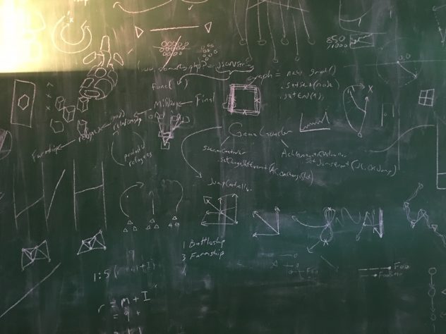
Brian D. worked on faction capital ship models, solidified the Irenic faction’s design, modeled refugee ships, and created 3D assets for the UI.
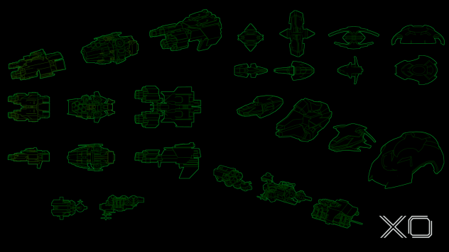
We did some thinking about factions and refugee ships in the game and decided that each of the five factions should have their own unique refugee ships. We thought it would be cool to share some work in progress on the look of those refugee ships:
Among many other things last month, Dominic improved overall performance, fixed movement artifacts, rewrote our shaders, worked on fleet encounters, faction relationship management based on player interaction, and resource collection and management.
Brian J. spent time unlocking the mysteries of the Steam store page, and made sure all of the your Kickstarter backer eponyms were added in, but most of the time last month was on the user interface for the game.
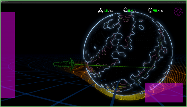
When we’re designing new UI, we use a bright magenta color as a placeholder for final art that is coming – that bright color makes certain we won’t accidentally leave placeholder art in the final game.
Here’s a look at the partially completed UI showing the three resources in the game. On the left you can see placeholder art for your fleet list, at top right is your faction relationship chart, and on the bottom right is your minimap.
Alex wrapped up her summer internship with us working on saving game states, player settings, and accessibility issues. We’ll miss you Alex!
Thanks everyone for the positive feedback and encouragement!
Brian Jamison
Portland, Oregon
